Last edit: 05-08-30 Graham Wideman
| Last edit: 05-08-30 Graham Wideman |
Excel |
| XLChartMatic Part 2: Organizing Data for Large Numbers of Points and
XLChartMatic Article created: 2005-03-04 |
In this section I describe an arrangement of data that will be easy to generate from a database, and which XLChartMatic will be able to wrangle for Chart. I'll use an XY Scatter chart as an example, but this applies also to Line, Bubble and other charts.
In this and following pages I'll use a contrived example involving data for subjects in a dieting experiment. The experimenter hypothesizes that gender and eye-color are factors influencing weight loss. Weight measurements were taken when each subject enters the program, and at several time points thereafter. Sample data looks as follows:
| Subjects | Measures | |||||||||||||||||||||||||||||||||||||||||||||||||||||||||||||||||||||||||||||||||||||||||||||||||
|
|
So the task is to plot Weight vs Time for each Subject, connecting each subject's points with lines. In Excel Chart, the most obvious way to do this is to assign each subject to a data series. The chart below shows the approximate result we're looking for:
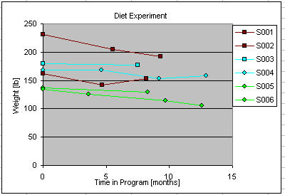
Obviously this sample data is not very extensive, but the ideas here do extend to hundreds of data series and thousands of points.
First, I've noticed that many descriptions for setting up an XY Scatter Chart with more than one series suggest the following arrangement of data in Excel:
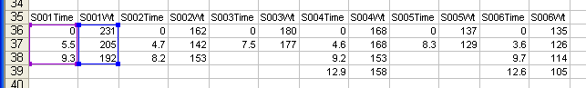
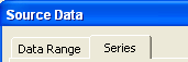
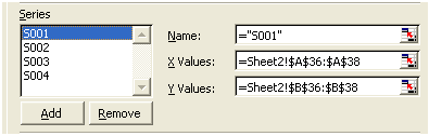
One pair of columns for each series. Here Series S001 is selected, with the purple box outlining the X values, and the blue box around the Y values. For chart, you specify ranges using...
| ... the Source Data dialog Series tab | ... with the X Value and Y Value slots. |
 |
 |
From the Excel point of view, one arrangement of data is as good as another, as these rectangles of data have to be specified by hand. But in terms of arranging data from some other source, such as a database, this is a relatively difficult layout to accomplish automatically.
Instead, we would prefer to lay out data with one row per point, as that's very easy to generate using a database query. Here, for example, is how to do it in Access, starting with the two tables shown above:
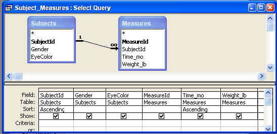
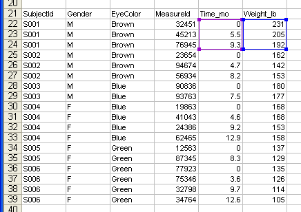
.. which produces a datasheet view that can be pasted into Excel where it looks like the following...
Now if only we could select those X and Y values for Chart automatically...
| Tips for copying data from Access to Excel:
1. Selecting Data for Copying. When viewing data in Access's datasheet view (either
table or query) you can make the following selections quickly: 2. Paste-to-Excel Gotcha: When pasting tables of data from Access to Excel, use
Excel's Paste Special > Text method. If instead you use the default Paste method, then
between Access and Excel, they manage to paste numbers so that they appear in Excel formatted as
text. The result will look fine, but Chart won't understand numbers that are stored in cells as
text. (Access and Excel 2002). |
XLChartMatic's core job is to read data such as that shown above in "easy-for-databases" arrangement, figure out where the data rectangles should be (in this case using the SubjectId column to tell one series from another), and tell that to Excel Chart.
To instruct XLChartMatic exactly where the relevant columns are, we add an additional row of column heads.
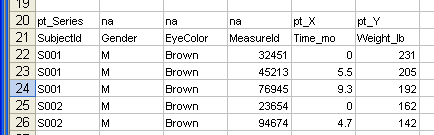
The details of the added column heads layout will be explained in a subsequent page, but you can see that the heads pt_Series, pt_X and pt_Y tell XLChartMatic all it needs to know for the job.
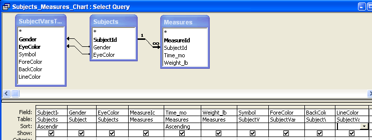
XLChartMatic is also able to read some additional columns containing formatting information for each point. Generating these from the database is quite straightforward. We can for example create a table telling how to translate the subject variables Gender and EyeColor into formatting:
SubjectVarsToChart
| Gender | EyeColor | Symbol | ForeColor | BackColor | LineColor |
|---|---|---|---|---|---|
| F | Blue | Circle | 1 | 8 | 8 |
| F | Brown | Circle | 1 | 9 | 9 |
| F | Green | Circle | 1 | 4 | 4 |
| M | Blue | Square | 1 | 8 | 8 |
| M | Brown | Square | 1 | 9 | 9 |
| M | Green | Square | 1 | 4 | 4 |
... which we can then use in an extension of the previous query:
... to provide the following data in Excel:
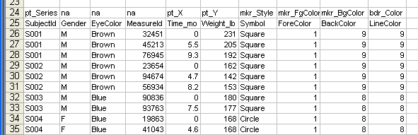
Again, details on the chart attribute columns are on a subsequent page, but as a preview, XLChartMatic knows how to set a variety of useful Series and Point formatting.
Go to: ![]() or up to XLChartMatic for Microsoft Excel
or up to XLChartMatic for Microsoft Excel